Visualizing Manager Coaching Scores
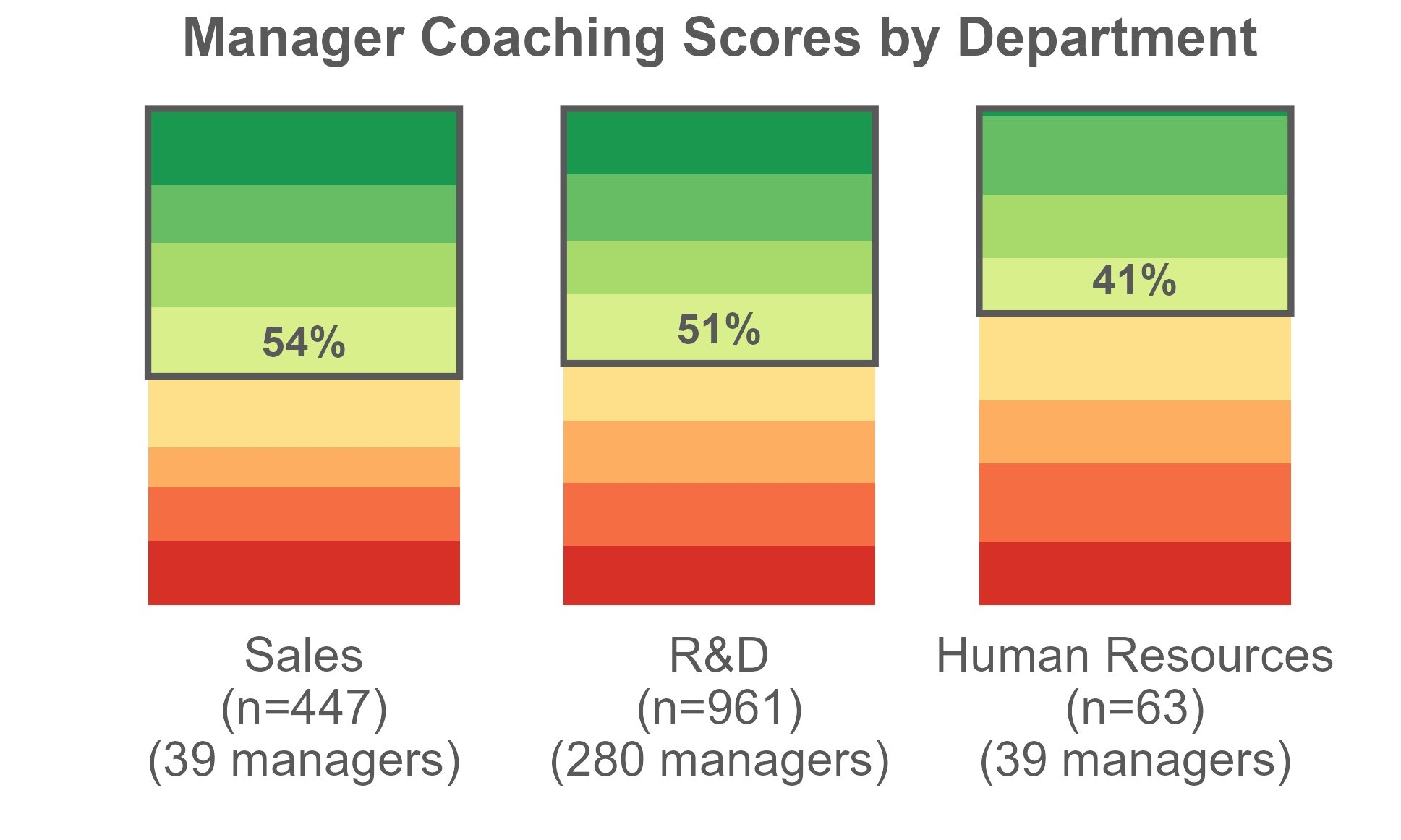
This visualization originated as an attempt to use ggplot2 in R to re-create a visualization originally created in Excel, streamlining the creation of visualizations for additional data.
HR Data Analyst with an MA in Industrial Organizational Psychology.
Skilled in in Data Analysis in Excel, R, Python, and SQL, and Data Visualization.
This visualization originated as an attempt to use ggplot2 in R to re-create a visualization originally created in Excel, streamlining the creation of visualizations for additional data.
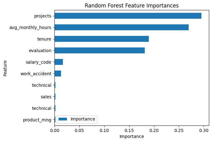
In this project, I analyzed a simulated dataset from Kaggle and used logistic regression and random forest modeling techniques to predict employee turnover using Python.
This case study utilizes intermediate and advanced SQL skills (hosted by DataInMotion). Image by Daniel Brady on Unsplash

A collection of visualizations and dashboards I've created in Tableau.

A collection of dashboards I've created in Power BI.